Treatment structure
Individual paths for the therapies keep the main page scannable while giving each subject enough space for the clinic’s own educational and research-backed material.
Case study · Spring 2026 · Web design · Development
A calm, credible home for a Brookings clinic, designed to organize detailed treatment information without turning the patient experience into a wall of medical copy.
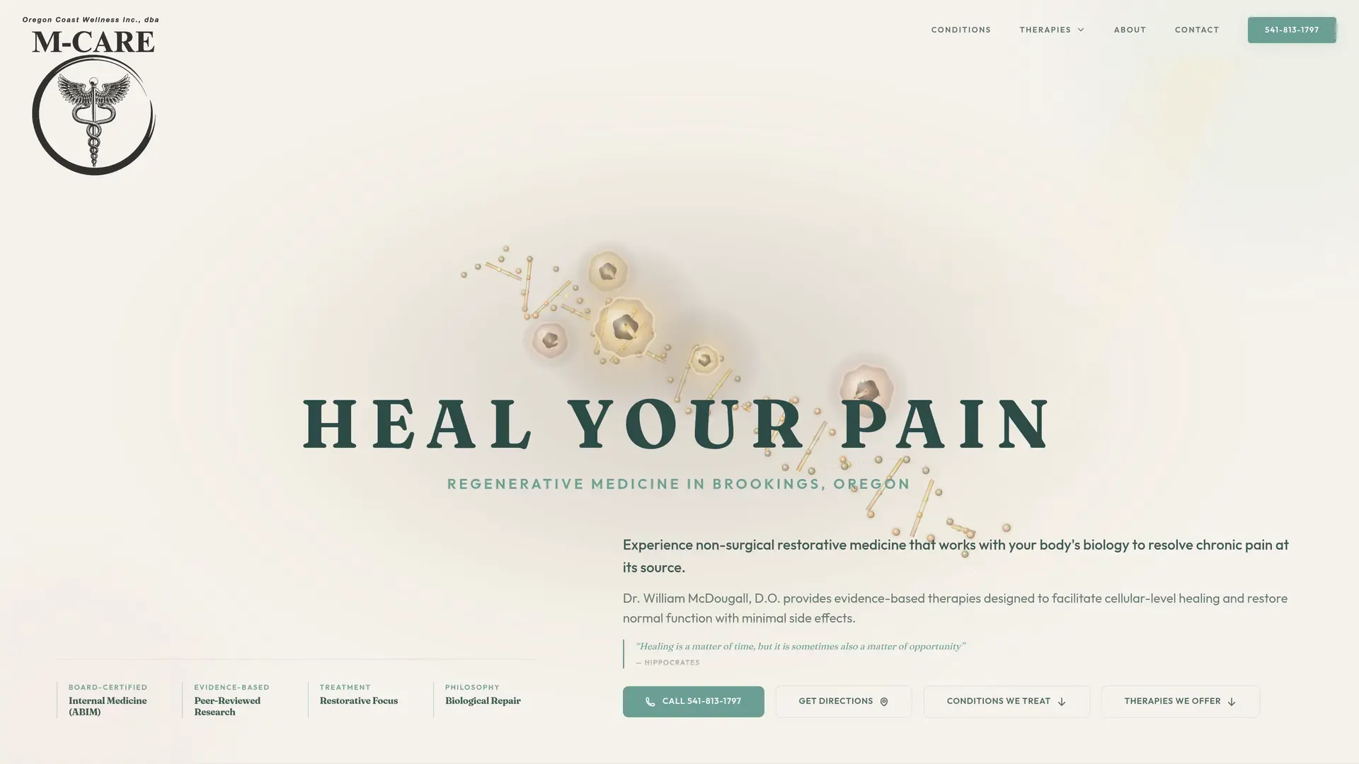
The context
M-Care is a regenerative-medicine clinic at 503 Railroad Street in Brookings, Oregon. The practice is led by William McDougall, D.O., who is board-certified in Internal Medicine. Its live site presents non-surgical pain care and a range of therapies that require more explanation than a name, phone number, and address can provide.
The site covers focused shockwave treatment, platelet growth factors, prolotherapy, ozone therapy, and IV nutritional therapy. It also introduces conditions, the clinic’s treatment philosophy, research resources, physician background, hours, directions, and contact details. The design had to make that volume of information easier to approach without making medical outcomes or promises on the clinic’s behalf.
Because people may arrive with different levels of familiarity, the opening does not require them to choose a treatment immediately. Separate paths for conditions and therapies let a visitor begin with the language they already know, while a clear call action and directions remain available for someone ready to contact the clinic.
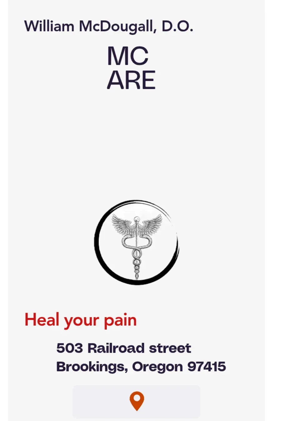
Before and after
The design direction
The earlier page centered the physician’s name, the M-Care mark, a short “Heal your pain” statement, and the Brookings address in a long vertical composition. It identified the practice but left little room to explain what a prospective patient would encounter.
The redesign keeps the established medical symbol and central message, then builds a broader visual language around muted cream, forest green, sage, and fine typographic detail. Abstract biological imagery adds depth to the opening without competing with the information patients came to read.
The homepage separates conditions, therapies, physician background, and contact into recognizable sections. Treatment pages can hold the longer explanations and research context, while the opening page maintains orientation through consistent navigation and repeated paths to call, get directions, review conditions, or explore therapies.
Research links are presented as source material within the site rather than reduced to promotional badges. That distinction matters in a medical setting: the interface can make the clinic's references easier to find, but it should not turn them into an invented promise about what any individual patient will experience.
What was built
Individual paths for the therapies keep the main page scannable while giving each subject enough space for the clinic’s own educational and research-backed material.
Dr. McDougall’s name, board certification, clinic philosophy, address, and hours sit close to the decisions they help inform instead of being isolated on a generic about page.
Phone, directions, conditions, therapies, and contact remain clearly labeled across screen sizes, helping visitors move through information at their own pace.
Responsive structure
The old asset was already shaped like a narrow mobile poster. The redesign preserves that directness on smaller screens but adds the missing depth: treatment navigation, readable sections, physician information, and contact routes reflow into a single column instead of reproducing the wide desktop composition at a reduced scale.
Need a site for a Brookings business?