Place-first storytelling
Riverfront photography, the park grounds, and the surrounding landscape communicate the character of Riverside before the page asks a visitor to sort through rates or rules.
Unlaunched concept · Spring 2026 · Brand direction · Web design
A proposed redesign, built and ready to launch. The concept brings Riverside’s riverfront setting and practical stay information into one warmer booking experience.
The context
Riverside RV Park sits on the north bank of the Chetco River in Brookings, about one mile from ocean beaches and six miles from the California border. The park describes itself as family-owned, open year-round, and oriented toward a quiet stay among river views, gardens, shade trees, fruit trees, flowers, and berries.
A useful park website has to do two jobs at once. It needs to make the place feel worth the trip, and it must answer practical questions about facilities, rentals, seasonal rates, nearby activities, and how to book. The proposed design gives those two jobs a clear shared structure.
The park's existing website identifies full hook-ups, river sites, tenting, restrooms and showers, a dog park, clubhouse and laundry, pavilion, and boat-ramp access. The concept brings those specifics forward so visitors can compare the practical parts of a stay while the photography establishes the quieter character of the park. Booking remains deliberately direct through the park's published phone number, and the North Bank Chetco River Road address anchors the destination in Brookings.
Before and concept
The design direction
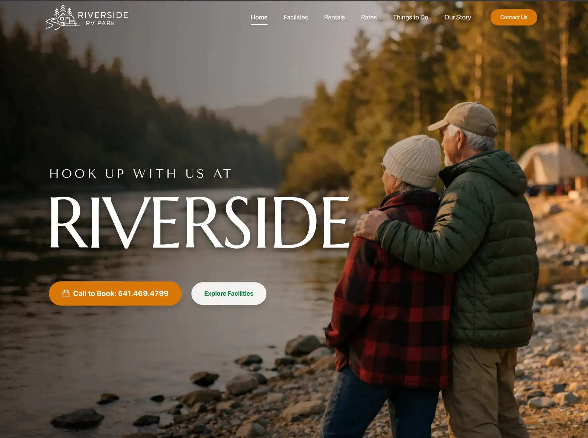
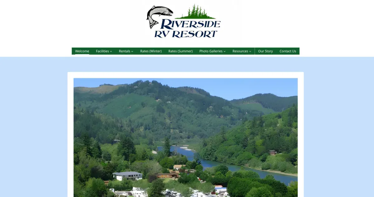
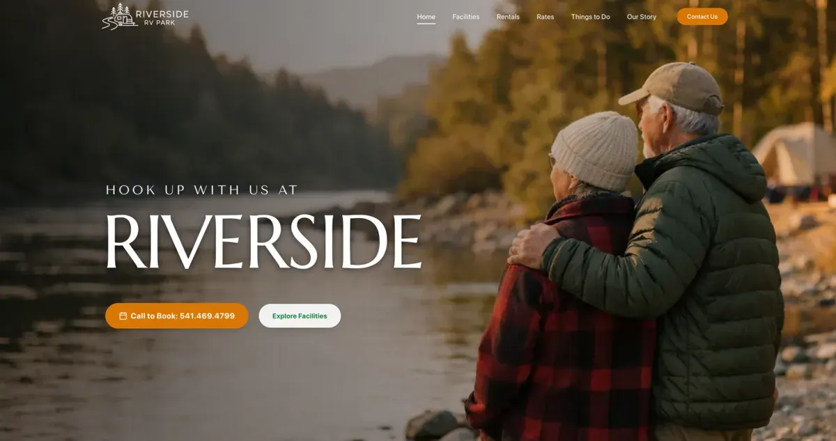
The previous page placed a large logo above compact navigation and a scenic image inside a white frame. The proposed opening lets the riverbank occupy the full screen. A restrained mark, generous type, and the line “Hook up with us at Riverside” establish the park without covering the view in interface elements.
The Wayback Machine's April 5, 2025 capture shows how much the old homepage asked one frame to carry. A long menu split facilities, a site map, two rentals, separate summer and winter rates, two photo galleries, fishing, resources, directions, and contact into individual paths. The page also embedded a Brookings weather panel beneath the welcome copy. The information was present, but the riverfront setting and the steps needed to plan a stay competed for attention.
Warm orange is reserved for the primary call-to-book action, echoing the evening light in the photography. An adjacent facilities path supports visitors who are still comparing options, while the navigation keeps rentals, rates, things to do, the park story, and contact information within reach.
The concept carries the same natural palette into photographs of the grounds and park amenities. Brookings information becomes part of the experience rather than an unrelated travel appendix, helping a visitor understand both the property and what surrounds it.
A compact river-and-campsite mark also replaces the larger fish-led header treatment. It can sit over photography without taking over the scene, leaving more visual room for the destination while keeping the park name present across the navigation.
What was built
Riverfront photography, the park grounds, and the surrounding landscape communicate the character of Riverside before the page asks a visitor to sort through rates or rules.
Facilities, rentals, seasonal rates, and contact details receive dedicated paths so a prospective guest can compare the practical parts of a visit without hunting through one page.
The concept connects the Chetco River location with nearby beaches and local things to do, giving the park a useful role in planning more than the overnight stop.
Planning a Brookings website?